
Minimalist packaging and bold packaging can both sell extremely well—but they sell for different reasons, to different customers, and in different channels. Minimalism often wins on trust, premium cues, and clarity. Bold design often wins on stopping power, fast recognition, and impulse conversion. If you’re building packaging for bottle packaging, jar packaging, pump & dispenser, flexible packaging, paper boxes, cosmetic packaging, pharmaceutical containers, supplement packaging, or daily chemical packaging, the real question isn’t “which style is better,” but which style is better for your category, price point, and shopper behavior.
What minimalist packaging design means
Minimalist packaging is defined by restraint and clarity:
- Fewer colors, fewer graphic elements
- Strong whitespace and clean layout
- Simple typography and limited claims
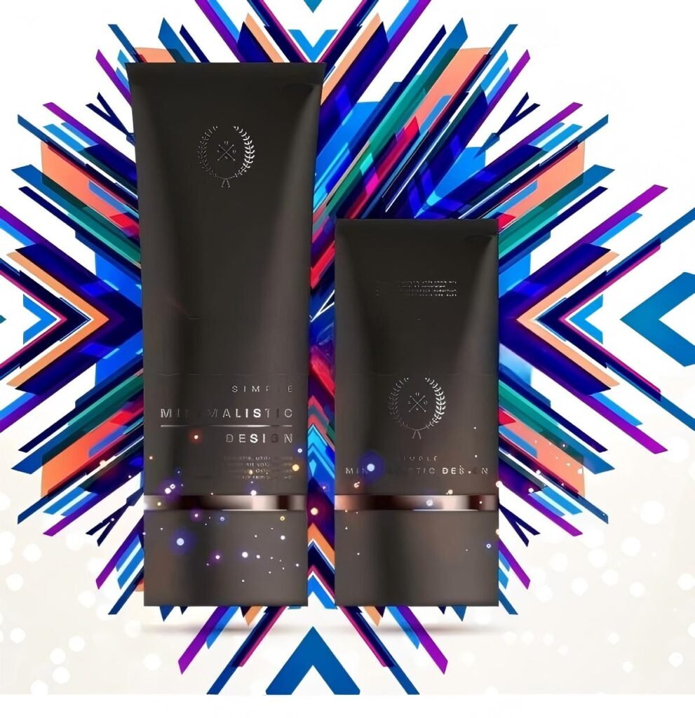
- Controlled finishes such as matte, soft-touch, or clear label architecture
- A “quiet confidence” premium feel
Minimalism is not “empty design.” It’s a deliberate hierarchy where the customer understands the product in seconds.
What bold packaging design means
Bold packaging focuses on attention and differentiation:
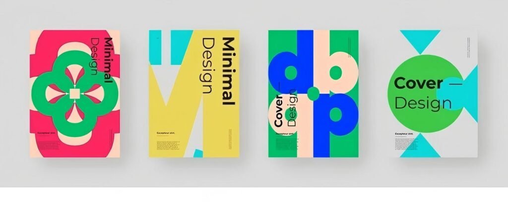
- High-contrast colors and larger typography
- Strong patterns, illustrations, or graphic systems
- More visible variant coding and shelf blocking
- Energetic brand personality
- Clear “look at me” presence at distance
Bold design is not “clutter.” The best bold packaging still has hierarchy—just with more visual power.
What sells more depends on three real-world factors
Category buying psychology
- Trust-heavy categories like pharmaceutical containers and many supplement packaging products often benefit from clarity and restraint.
- Self-expression categories like cosmetic packaging, fragrance, and lifestyle goods can perform strongly with bold visual identity.
Sales channel
- E-commerce thumbnails reward clarity and simple recognition.
- Retail shelves reward stopping power and quick differentiation.
- Amazon-style grids reward a strong silhouette and clean front-of-pack hierarchy.
Brand positioning
- Premium pricing often pairs naturally with minimalist design.
- Value, fun, and high-energy brands often convert better with bold design.
The psychology behind which design converts better
Processing fluency
People trust what they can understand quickly. Minimalist packaging usually improves fluency by reducing visual noise and making the product type and benefit obvious. This can increase conversion when shoppers are cautious or comparing ingredients.
Visual salience
People notice what is visually loud or distinct. Bold packaging increases salience, especially in crowded shelves or when shoppers are browsing quickly. This can increase impulse adds and trial purchases.
Perceived value signals
- Minimalist design can signal “premium,” “clinical,” “modern,” and “high-quality.”
- Bold design can signal “fun,” “strong effect,” “youthful,” “high energy,” or “more for your money.”
Risk reduction
For products applied to skin or ingested, shoppers look for safety signals: clean typography, professional layout, and credible structure. Minimalism often performs well here, but bold can still work if the hierarchy stays disciplined.
Minimalist packaging advantages
Stronger premium positioning
Minimal packaging often increases perceived price fairness. This is powerful for:
- High-end cosmetic packaging
- Glass bottle packaging for serums and oils
- Premium jar packaging for creams
- Professional supplement packaging with science-forward positioning
Better clarity and trust
Minimalism makes it easier to communicate:
- Product type
- Key benefit
- Usage instructions
- Compliance text and warnings when needed
This is a big advantage for pharmaceutical containers and supplements where readability is directly tied to trust.
Easier line extensions
Minimal design systems scale well across SKUs because they rely on consistent templates and restrained variant coding.
Minimalist packaging risks
Weak shelf stopping power
If your category is visually loud, a minimal pack can disappear—especially in retail. You may need stronger contrast, bolder typography, or a distinctive shape to avoid blending in.
Can look generic if not executed well
Minimalism requires excellent typography, spacing, and material quality. If print quality is low or hierarchy is weak, the pack can look unfinished rather than premium.
Harder to differentiate similar products
If many competitors use “clean minimal,” you’ll need differentiation through:
- silhouette
- material choice
- cap/closure finish
- a signature brand color or icon system
Bold packaging advantages
Higher attention in retail and browsing
Bold packaging often wins when customers are scanning quickly. This helps:
- Daily essentials in daily chemical packaging
- Trend-driven cosmetic packaging
- Flavored or lifestyle supplements where discovery matters
- Seasonal launches and limited editions
Stronger memory and brand recognition
Bold systems make it easier to remember your brand family at a distance—especially with consistent color blocking across SKUs.
Better for new brands needing instant identity
If you don’t have brand awareness yet, bold packaging can create “first impression clarity” by being unmistakable.
Bold packaging risks
Can reduce trust if it feels exaggerated
In health-adjacent categories, bold claims + loud graphics can trigger skepticism. If you sell supplements or pharma-adjacent products, bold is safer when the front panel stays clean and factual.
Can look cheaper if overdone
Overprinting and too many colors can push the pack into a mass-market feel. That may be good for value positioning, but it can hurt premium pricing.
Higher production complexity
Bold design may require more ink coverage, tighter color control, and sometimes more finishing steps—raising cost and increasing the chance of print variation across batches.
What sells more in your packaging format
Bottle packaging
- Minimalist tends to sell more when the bottle is premium, the product is high-value, and trust matters. A clean label plus a premium cap finish often outperforms heavy graphics.
- Bold tends to sell more when the category is crowded and fast-moving, or when benefits are experiential and lifestyle-driven.
Practical tip: if your bottle is clear or frosted, minimal labels often look premium. If your bottle is opaque plastic, bold color blocking can improve shelf recognition.
Jar packaging
Jars are displayed at home, so design affects repeat impression.
- Minimalist jars often sell better for skincare, creams, and premium supplements because they feel “clean” and “safe.”
- Bold jars often sell better for fun categories like scrubs, masks, or bright lifestyle brands, but the lid finish and print discipline must stay high-quality.
Pump and dispenser
The dispenser is part of design psychology.
- Minimalist branding can be destroyed by a cheap-feeling pump.
- Bold branding can be undermined by leaky pumps or actuators that break.
Either style sells more only when the pump & dispenser performance matches the brand promise: smooth actuation, correct dosage, no drips, and shipping locks where needed.
Flexible packaging
Pouches are highly visual and often compete in grids.
- Bold flexible packaging often wins for discovery and variety.
- Minimalist pouches can win for “clean ingredient” and premium refill concepts, especially when the front-of-pack hierarchy is extremely clear.
Paper boxes
Paper boxes often carry your storytelling.
- Minimalist boxes feel premium and giftable with clean typography and restrained printing.
- Bold boxes can create strong shelf blocking and limited edition excitement.
Avoid heavy lamination if sustainability messaging matters; use structure and paper choice to create premium feel.
A decision framework to choose minimalist or bold
Step 1: Define your purchase behavior
- If shoppers compare carefully, read labels, and worry about safety: lean minimalist.
- If shoppers browse, impulse buy, or choose by vibe: lean bold.
Step 2: Match your price tier
- Premium tier: minimalist or controlled bold with high-quality finishes.
- Mass tier: bold often improves conversion and recognition.
Step 3: Choose your main differentiation tool
You only need one “hero” differentiator:
- Minimalist brand: differentiate through silhouette, materials, and one signature color.
- Bold brand: differentiate through color blocking, typography, and a consistent graphic system.
Step 4: Consider your channel mix
- E-commerce heavy: prioritize clarity at thumbnail size; minimal often performs well, but bold color blocking can also work.
- Retail heavy: bold can win attention, but minimal can win premium if it stands out through contrast and structure.
Hybrid design often sells the most
Many top-performing brands are not purely minimalist or purely bold. They use a hybrid system:
- Minimal front panel hierarchy for trust and clarity
- Bold brand assets like a strong accent color, pattern on side panels, or a signature cap color
- Clear variant system so customers can quickly pick the right SKU
This approach works especially well for:
- supplement packaging that must feel credible but still distinctive
- daily chemical packaging that must be readable but recognizable at a distance
- cosmetic packaging that must feel premium but shareable
How to test which sells more for your brand
Packaging is measurable if you test it like performance marketing.
E-commerce testing
- A/B test hero images with two label styles
- Track conversion rate, add-to-cart rate, and return reasons
- Monitor reviews mentioning “looks cheap,” “premium,” “confusing,” or “misleading”
Retail testing
- Run a 3-second shelf test: can shoppers identify product type and key benefit quickly
- Compare velocity in similar stores or regions
- Evaluate “standout” at 6 feet and readability at 1 foot
Operational testing
A design that sells but damages in transit loses money. Validate:
- scuff resistance
- carton crush resistance
- leakage performance for liquids
- pump lock performance for shipping
Category recommendations
Cosmetic packaging
Often performs best with:
- Minimalist premium base + one bold brand signature
- Strong tactile cues: matte labels, clean glass, quality caps
- Protective shipping that avoids scuffing and crushed boxes
Pharmaceutical containers
Usually performs best with:
- Minimalist, clinical clarity
- High readability and compliance-forward layout
- Conservative but trustworthy branding
Supplement packaging
Often performs best with:
- Clear hierarchy and high trust signals
- Minimalist design with bold accent coding for variants
- Strong tamper-evidence and clean printing quality
Daily chemical packaging
Often performs best with:
- Bold recognition for fast selection
- Clear instructions and benefit icons
- Ergonomic packaging that makes daily use easy
Common mistakes that reduce sales in both styles
- Weak hierarchy: customers can’t tell what the product is quickly
- Overclaiming: too many promises reduce credibility
- Ignoring packaging performance: leaks, broken pumps, crushed boxes kill repeat purchase
- Inconsistent system across SKUs: brand becomes hard to recognize
- Choosing style based on personal taste, not shopper behavior and channel reality
FAQ
Is minimalist packaging always more premium
Often, but not always. Minimalism feels premium when print quality, spacing, materials, and component quality are high. Poor execution can make minimal packaging feel generic.
Does bold packaging increase sales
It can, especially in retail or discovery-driven categories where attention is the main bottleneck. Bold design must still keep the product type and key benefit clear.
Which style is better for e-commerce
Minimal often performs well because it reads clearly at thumbnail size, but bold color blocking can also win if it stays simple and consistent across SKUs.
Can I combine minimalist and bold design
Yes, and many brands sell best with a hybrid approach: clean front panel clarity plus bold signature elements for recognition.
Build packaging that converts with Supply-Packagings
Supply-Packagings provides supply packagings for everything, including Bottle Packaging, Jar Packaging, Pump & Dispenser, Flexible Packaging, Paper Boxes, Cosmetic Packaging, Pharmaceutical Containers, Supplement Packaging, and Daily Chemical Packaging. If you’re deciding between minimalist vs. bold packaging design, we can help you match design style to the right materials, finishes, and structures—then scale it reliably with production-ready packaging that protects your product and supports repeat purchase.
Share your product category, target channel, price point, and packaging format, and we can recommend a packaging direction that sells better and performs better in real shipping and retail conditions.