
Packaging colour is one of the fastest “signals” the brain processes—often before customers read a single word. In retail aisles and e-commerce thumbnails, colour shapes expectations about quality, safety, price, scent/flavour, and who the product is “for.” This article explains how packaging colours influence buying decisions, how to choose a colour system that fits your category, and how to apply colour consistently across formats like bottle packaging, jar packaging, pump & dispenser, flexible packaging, paper boxes, cosmetic packaging, pharmaceutical containers, supplement packaging, and daily chemical packaging.
Why colour affects sales so strongly
Colour influences buying because it impacts three things at the same time:
- Attention
High-contrast or distinctive colours get noticed first. - Meaning
Customers assign category cues instantly, such as “clinical,” “natural,” “luxury,” “kids,” or “strong cleaning power.” - Trust and perceived risk
In skincare, supplements, and pharmaceuticals, colour can make the product feel more credible and safe—or overly “marketed.”
In crowded categories, the right colour can reduce the mental effort to choose, which often increases conversion.
How shoppers process packaging colour in seconds
Most customers follow a simple visual sequence:
- Spot the pack by colour blocks and contrast
- Classify it into a category (medical, natural, premium, fun)
- Assume a price tier (value vs premium)
- Confirm with text (product type, key benefit, size)
If your colour communicates one message while your product claims communicate another, customers hesitate—and hesitation lowers sales.
Colour elements that matter more than “the colour”
Brands often debate “blue vs green,” but real performance comes from controlling the full colour system:
Hue
The basic colour family: blue, green, red, purple, etc. Hue sets the category mood.
Saturation
How vivid or muted the colour is. High saturation feels energetic and loud; low saturation feels calm and premium.
Brightness
Light vs dark tones. Dark can feel premium or intense; light can feel gentle, clean, or clinical.
Contrast
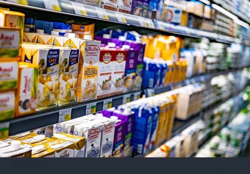
Contrast drives readability and shelf stopping power. Poor contrast makes packs disappear, especially online.
Colour blocking
Large, consistent blocks of colour improve recognition and repeat purchase because customers “shop by colour.”
What common colours typically communicate in packaging
Colour meanings vary by market and category, but these patterns are widely seen in consumer packaging:
White
- Clean, minimal, clinical, gentle
- Often used in pharmaceutical containers, dermatologist-style skincare, and “sensitive” lines
- Risk: can look generic if typography and materials are weak
Black
- Luxury, high price, intensity, premium performance
- Common in fragrance, men’s grooming, high-end cosmetics
- Risk: can reduce readability if overused, and can feel “harsh” in wellness categories
Blue
- Trust, safety, hydration, science, calm
- Strong fit for skincare, dental, medical-adjacent supplements
- Risk: too many competitors use blue; you need differentiation through shade or structure
Green
- Natural, botanical, eco-friendly, gentle
- Strong in clean beauty and sustainable positioning
- Risk: triggers greenwashing skepticism if claims are vague or packaging isn’t actually sustainable
Red
- Energy, urgency, strength, appetite, “fast results”
- Works for promotions and performance cues
- Risk: can feel aggressive or “too chemical” in natural skincare
Yellow and orange
- Friendly, warm, approachable, value, vitality
- Strong for vitamins, citrus scents, household cleaning
- Risk: can signal lower price tier if not executed with discipline
Purple
- Premium, beauty, calm, sleep, self-care
- Common for anti-aging, nighttime routines, magnesium/sleep supplements
- Risk: can feel “cosmetic” rather than clinical for pharma-style products
Brown and kraft tones
- Earthy, handmade, organic, low-processing
- Strong for paper-forward packaging and natural brands
- Risk: can look “cheap” if print quality and structure aren’t strong
Packaging colour by category and product type
Your best colour strategy depends on what the customer is trying to solve: beauty, health, hygiene, cleaning power, safety, or gifting.
Cosmetic packaging
Colour is a major conversion lever in cosmetics because customers buy with identity and emotion.
High-performing approaches:
- Minimal base colours with one signature accent colour
- Soft neutrals for premium skincare
- Bold colour blocking for makeup and trend-led launches
- Colour-coded variants for routines (AM/PM, skin type, concern)
Practical tip: if your primary pack is premium (glass bottle packaging, thick-wall jar packaging), you can often reduce colour and rely on material + finish for value cues.
Pharmaceutical containers
Pharmaceutical-style packaging typically sells through clarity and trust.
Common patterns:
- White + one strong accent colour for clarity
- Blue for trust and medical credibility
- Limited saturation and clean typography
Avoid: overly playful colours that can reduce perceived seriousness unless your product is clearly positioned for children or lifestyle use.
Supplement packaging
Supplements sit between wellness lifestyle and medical trust. Colour must balance “approachable” with “credible.”
Common winning systems:
- Neutral base (white/black/gray) + colour-coded benefit families
- Blue for cognitive and daily essentials
- Green for botanical/herbal
- Purple for sleep/calm
- Orange for energy or immunity
Key requirement: make dosage and key benefit text highly readable. Poor contrast hurts conversion and increases returns.
Daily chemical packaging
Here, colour acts like a functional label. Shoppers often choose quickly and repeatedly.
Common patterns:
- Strong, saturated colours for fast recognition
- Colour families by function (bathroom, kitchen, laundry)
- High contrast for readability in low-light utility spaces
Also consider “in-home appearance”: people store these products visibly. A more premium, muted palette can improve loyalty for higher-end daily chemical brands.
Colour decisions across packaging formats
Colour is not just a design file—it’s a manufacturing choice. The best colour plan considers how colour will be produced across components.
Bottle packaging
Ways to apply colour:
- Coloured resin for plastic bottles
- Lacquer/coating for glass
- Label as the primary colour surface
- Frosted or tinted glass for premium cues
Considerations:
- Dark pigments can affect recycling sortability in some systems
- Consistency between cap colour and bottle colour is critical for “premium feel”
- For e-commerce thumbnails, high-contrast labels usually outperform subtle labels
Jar packaging
Colour often influences perceived cleanliness and richness.
- Light colours + matte finishes feel “clean skincare”
- Dark jars feel premium and protective (light-sensitive actives)
- Metallic lids can lift perceived value quickly
Be careful: heavy decoration can increase scuff visibility in transit. Protective packaging matters for maintaining premium appearance.
Pump & dispenser
Customers “feel” quality through pumps:
- A high-quality matte black or white pump can feel premium
- Inconsistent pump colour across batches can look low-quality
- For refill systems, a consistent pump colour becomes a brand signature
Flexible packaging
Pouches are highly visual and often compete in grids.
- Bold colours can win attention fast
- Minimal designs can signal premium “clean ingredient” positioning
- Ensure the colour system still reads when the pouch wrinkles or curves
Paper boxes
Paper boxes are excellent for colour storytelling:
- You can use one base carton colour and vary with sleeves, labels, or stickers
- Colour can guide routines (Step 1, Step 2) for skincare sets and supplements
- Avoid finishes that reduce recyclability if sustainability is part of your positioning
E-commerce vs retail: colour works differently
E-commerce colour rules
- Your packaging must be readable at thumbnail size
- Colour blocks help recognition more than detailed illustration
- High contrast between background and text improves conversion
- Consistent colour across product photos builds brand “scroll stopping power”
Practical test: shrink your product image to mobile thumbnail size. If you can’t read product type and brand quickly, adjust contrast and hierarchy.
Retail colour rules
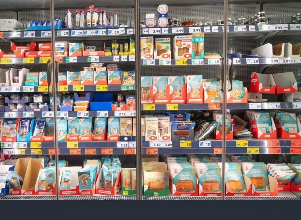
- You need stopping power at 3 to 6 feet
- You need clarity at 1 foot
- Shelf competition means “unique colour territory” matters
If every competitor is white + green in “natural skincare,” consider owning a different shade family while keeping natural cues through materials and copy.
Cultural and market differences you should not ignore
Colour meaning can change by region. Examples:
- White can signal purity in many markets, but can also signal mourning in some cultures
- Red can signal luck in some markets, but danger or warning in others
- Green can signal nature, but also carry strong regulatory/claim scrutiny when used with “eco” messaging
If you sell globally, validate colour choices market-by-market, especially for supplements and pharmaceutical containers.
Accessibility: colour must work for everyone
Colour-blindness and low-contrast printing issues can directly reduce sales and increase customer complaints.
Best practices:
- Don’t rely on colour alone to communicate variants
- Use icons, text labels, or patterns as secondary cues
- Maintain strong contrast for key information
- Avoid light gray text on white backgrounds for regulated categories
Clear communication is both a usability win and a trust win.
Sustainability and colour: a real trade-off
Colour impacts sustainability more than many brands realize.
Considerations:
- Certain pigments can reduce recycling sort accuracy for plastics
- Full-coverage printing can increase ink usage and complicate recycling in some structures
- Kraft or unbleached paper can reduce processing, but may limit vibrant colour results
- Dark or opaque colourants in plastic may reduce the value of recycled output streams
If sustainability is part of your brand, choose colour strategies that still support recyclability, and communicate claims precisely to avoid greenwashing.
A practical step-by-step method to choose packaging colours
Step 1: Define the job of colour
Pick one main goal:
- Stop scroll and improve first-time purchase
- Signal premium pricing
- Build clinical trust
- Communicate “natural” positioning
- Simplify variant selection
Step 2: Choose a base + accent system
A proven approach:
- One neutral base colour for brand consistency
- One signature accent colour for recognition
- Secondary colours only for variants
This reduces production complexity and keeps costs under control.
Step 3: Assign colours to product logic
Examples:
- AM routine vs PM routine
- Skin concern families
- Supplement benefit categories
- Scent families for daily chemical packaging
Customers buy faster when colour matches a clear product system.
Step 4: Validate colour in real materials
A “perfect” screen colour can fail in reality due to:
- paper absorbency
- film gloss and reflection
- bottle tint
- coating and varnish changes
- batch-to-batch variation
Always approve physical samples, especially for pumps, caps, and printed paper boxes.
Step 5: Test in your channel
- A/B test packaging images in ads and product pages
- Compare conversion and return reasons
- In retail, run quick “shelf tests” for recognition and readability
Common colour mistakes that reduce sales
- Low contrast that makes key information hard to read
- Too many colours across SKUs, weakening brand recognition
- Colour cues that don’t match the product promise
- “Eco green” colour used without credible sustainability proof
- Inconsistent colour between cap, label, and box, which looks low quality
- Printing too dark on kraft paper and losing clarity
FAQ
Do packaging colours really affect sales
Yes. Colour influences attention, perceived value, and trust before customers read details. In crowded categories, colour and contrast can be the difference between being noticed and being ignored.
What packaging colour looks most premium
Often black, white, deep neutrals, and low-saturation palettes look premium—when paired with high-quality typography, finishes, and components. Premium is more about consistency and execution than a single colour choice.
Is green packaging always seen as eco-friendly
Green often suggests “natural” or “eco,” but customers are increasingly skeptical. If you use green to imply sustainability, support it with clear, verifiable claims and practical disposal guidance.
How do I choose colours for product variants
Use a consistent system: keep brand elements stable, then use one distinct accent colour per variant. Add icons or text so customers don’t rely on colour alone.
Packaging colour execution with Supply-Packagings
Supply-Packagings provides supply packagings for everything, including Bottle Packaging, Jar Packaging, Pump & Dispenser, Flexible Packaging, Paper Boxes, Cosmetic Packaging, Pharmaceutical Containers, Supplement Packaging, and Daily Chemical Packaging. If you’re redesigning packaging colours, we can help you choose colour strategies that work in real materials, photograph well for e-commerce, stay consistent across production, and match your sustainability and compliance requirements.
Share your product category, target markets, packaging format, and desired brand positioning, and we can recommend a colour system and packaging structure that supports both conversion and long-term brand recognition.